Gary and I had a very interesting conversation regarding future possible processes. He suggested that stick on paper, or find ways of sticking on thinner metals.
Cross sticking was also mentioned, to use in cases of toning. I could possibly drill through metal and pass wool through as a way of combining both techniques.
The use of soluble fabric with sticking could also help with layering of fabric.
Gary mentioned that I could apply a Cy Twombly way of sticking on my canvases, adding a layer of abstraction, which I found extremely interesting and inspiring.
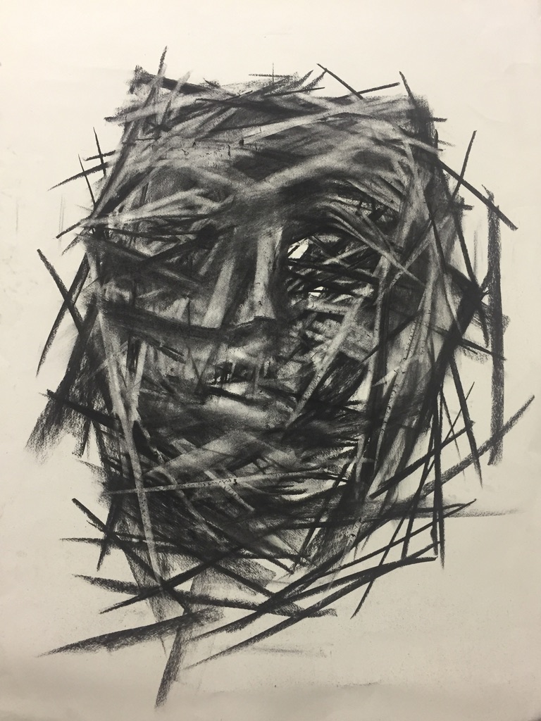
Below is an image of a portrait that I made a few years ago, I am finding myself trying to re-appropriate this way of drawing to my paintings, adding a layer by way of stitching.
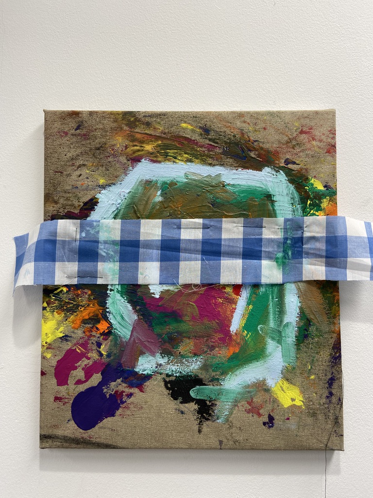
Taking note of my previous experiments, I started painting on stretched fabric, implementing layering and weaving through the work.
I however didn’t succeed in the way in which I had previously intended. The layers are not transparent enough, partly due to the absorbing qualities of the material. In the future I would like the works to be of a more abstracted nature, as I find this figurative approach of a more limited nature, ending any possibility for symbolism.
This is just a note of quote by Tracey Emin that I thought I should keep on record… : “I can draw accademically, that’s why I can tear it apart”
I really admire Tracey Emin’s stylistic ways of paintings, her loose brushwork and expressive mark making is something that I really aim to include in my own work.
An Insane Desire For You, 2019
I aim to try and take a way of weaving through my paintings in the way I which Emin paints, making it hard to distinguish the media from afar.
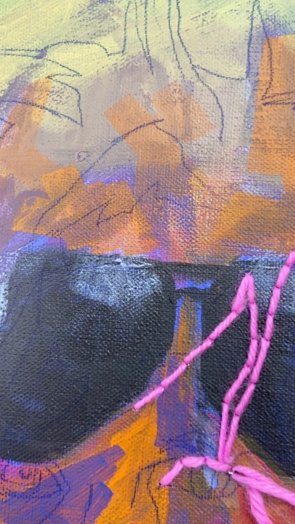
I started painting a portrait of Warhol. I decided to paint him as he has such emblematic features, haircut and pose, that I thought they would be easily translatable through painting as an experiment. His reduction of shapes through the use of colour and lines, the immediacy of painting are also what lead me to use him as a sitter. I was trying to create borders with ways of panting.
For this work I was experimenting with complementary colours of wool and background.
Whilst making this painting I was listening to Mark Bradford podcast about his show at Hauser and Wirth Gallery on Saville Row. One of the things he was talking about that stuck with me was a reference to the three headed dog who keeps the gates of hell, that he was using as an allegory for border keeping in contemporary times.
A following podcast was with artist Peter Doig talking and using both words “homely and crude” to talk about his paintings. I thought that it was extremely interesting in relation to what I was trying to achieve.
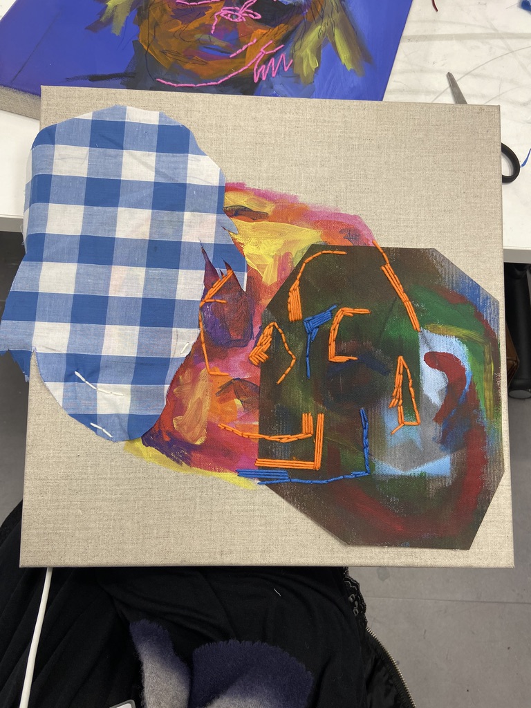
I went to buy fabrics in at attempt to use them to paint on a stick together. The idea was to replicate a similar visual idea as the one found in Matisse’s paintings, a familiarity and sense of a homely environment.
The experiment proved to be more difficult than expected, as first of all. the fabric seemed to be too thin and would outstretch the canvas, and no attempt to stretch it would result in a success. However I found that the way I had intuitively cut the fabric added a certain 3 dimensionality to the portraits or memento mori, adding a ghost silhouette to the painting.
I started experimenting with ideas of layering and cubism, using the fabric as a preliminary 3 dimensional shape to paint on.
from then on I decided to stick the fabric to a support rather than stitching it. The sticking could then come on top, as a way of painting rather than as a way of attaching.
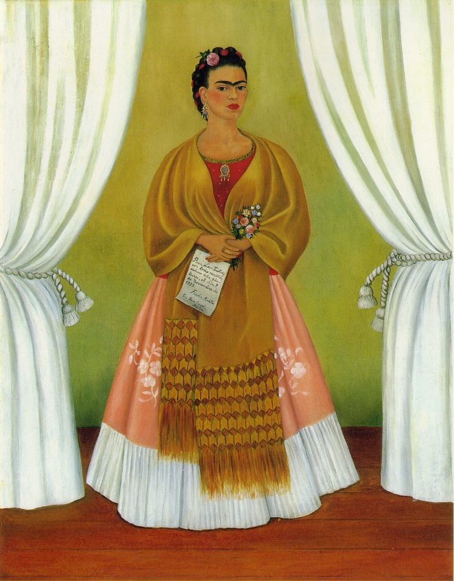
Having looked at Frida Kahlo, my research took me to the work of Rita Angus, and most specifically her work “Rutu”, painted in 1951. In this painting she represents herself as a Goddess of Mercy and Peace as linked to the land of her ancestors.
Similar rules of self portraiture and symbolism associate to the painting “Self Portrait (with moth and caterpillar)”
I have been attending lectures about portraiture at the RA, this one was about the acclaimed Mexican female artist Frida Kahlo. I have always been intrigued in her portrayal of herself as a woman, as a part of society and as a female artist at a time ruled by men.
I was intrigued by her use of symbolism in “Time Flies”, painted in 1929.
The use of the clock as a way of storytelling, as linked to the airplane above her head, create an allegorical conversation as a way of describing her longing for her partner Diego Rivera. I also found the symbolism in the familial setting behind her to be of interest: the books, curtains and warm hues used to paint all those elements.
In “Self Portrait on the Border”, painted in 1932, I was intrigued by the symbols such as plants and a sun used as a Voodoo symbol. The roots of plants have been elongated and made apparent in the foreground of the painting, close to a standing Frida. All theses objects contribute to a feeling of self reflection, questioning and longing, all attributes of the self portrait.
In ‘Between the Curtains”, painted in 1937, the artist uses elements of the homely, in this case curtains to frame herself within the painting.
The artist references Andre Breton and Surrealism in “What the Water Gave Me”, 1938. Kahlo uses the water of her bath to reflect her thoughts and dreams. I will aim to investigate and experiment with this way of language. The use of water as a reflecting medium also Brough me back to the work of the impressionists, and the value of mark making in reference to conceptual abstraction and reflections of thoughts.
“The Two Fridas“, painted in 1938 is a painting descriptive of terrible emotional pain and turmoil. It describes the feelings the artist felt when she found out her husband was having an affair with her sister. She is shown wounds, with 2 hearts, showing agony and despair.
“Self Portrait Dedicated to Dr Eloesser”, painted in 1940 I was captured by the necklace she painted herself wearing. It is reminiscent of a crown of thorns, however worn as a necklace around her neck.
In “The Broken Column”, painted in 1944, the artist portrays herself with nails in her skin, showing suffering, a towering yet fragile column is painted inside the core of her body, as it is being held up by a corset. It portrays a time in the artist’s life where she was about to be amputated as a consequence of an accident which’s consequences she had been trying to remedy from a young age.
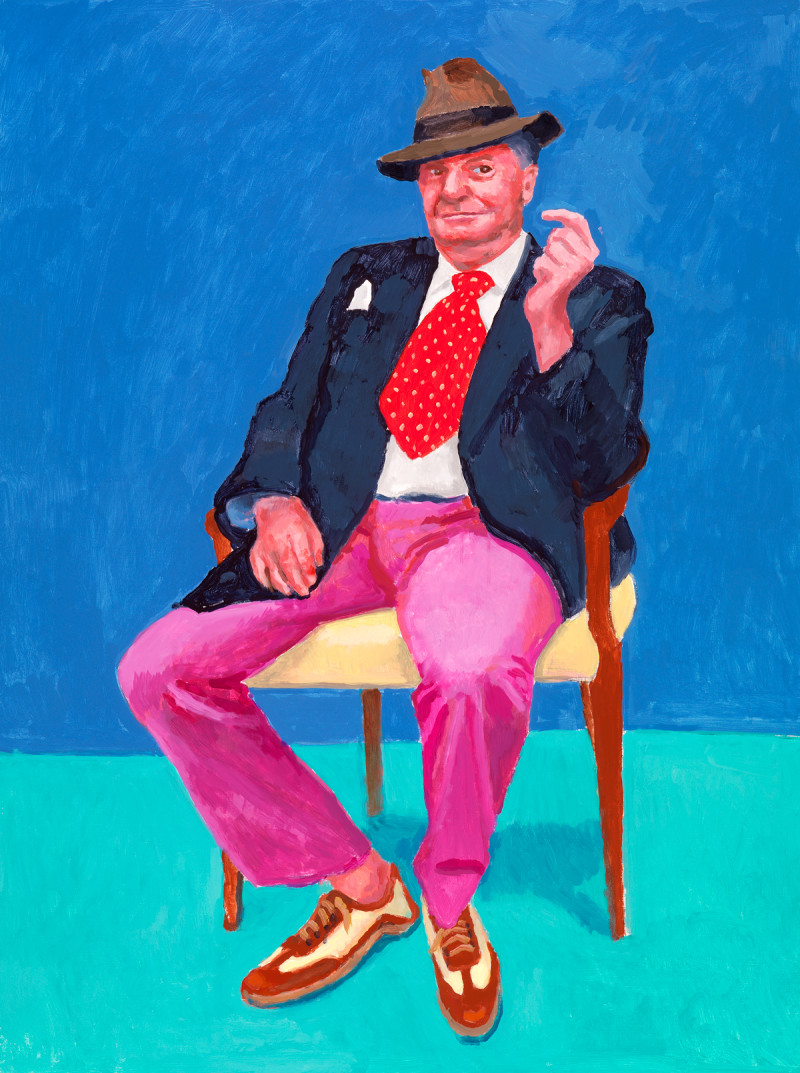
In his show “82 Portraits and a Still Life”, David Hockney in my opinion made a great case at describing a contemporary version of what Matisse had been doing with “Green Stripe”.
The artist’s use of acrylic is also a point of inspiration for my own work. I find that the use of this particular medium helps in the layering of bright colours. It also dries faster than oil, helping with the pace of painting.
Taking from past endeavours with regards to painting techniques and visual complications I am aiming to work with gradients of background patterns and colours.
I have been experimenting with the use of colour, and most particularly how shadows can be described by complementary colour as schemes. I am particularly interested in the way in which Matisse described faces and forms in “Portrait of Madame Matisse”
Green Stripe; 1905
In this portrait, Matisse uses colour to describe shadows and therefore shape. The Green line in the middle of the sitter’s face presents the viewer with a very clear delineation of the dark and light sides of the sitter’s face. In this painting, light turns into colour, creating a sense of vibration and drama.
The use of visible brushstrokes is also something that I am interested in. It enables the viewer to understand the artist’s use of layering and choice of colour.
One of my favourite works by the artist is The Goldfish, painted in 1912.
Goldfish; 1912
I saw it at the Pushkin in Moscow a couple of years ago and I was struck by its vibrant colours and compositional harmony. Matisse in my opinion is extremely talented in describing a sense of a homely setting, his use of a patterned background in this painting contributes greatly to the fullness of the composition and sense of a setting.


")